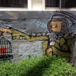
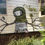
The old man and the bird in a sack image reminded me a lot of a puzzle game I played a few years ago, Machinarium.
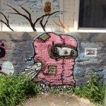
These sort of quirky images are what I find really interesting. They take a rather bland, and in this case boring grey wall and give it character and life.
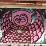
As someone said using Scrabble tiles, “Grey is the real art crime”.
]]>

So I was a little surprised when wandering recently to find that the previous graffiti had been replaced.
I love the colour and vibrancy of the first piece combined with the simplicity of the sleeping boy.
The second piece is seen properly when you walk into the little courtyard/garden beside the building. Again, it’s more art than graffiti and has a wonderful quality to it that reminds me of some of my favorite Anime like “Spirited Away” and “9”.
]]>
The piece is on the side of a small shop and by the looks of it, it's been there for a while. I love the feel of the piece and how it seems to fit within the character of the building and the business within. In fact, this was confirmed when I showed one of the others in our office and they immediately identified the name of the business.
So can good graffiti contribute in a positive way to the character of a space? I believe so and this piece seems to achieve both enhancing it's space along with becoming iconic for the business within.
]]>
I saw this particular piece of ”art” while walking down Montague Road past some of the more rundown industrial buildings. Upon closer inspection it appears to be a sticker as opposed to sprayed on. Despite this, I love the simplicity of it and the way it brightens up a rather drab bit of construction.
]]>